Appearance
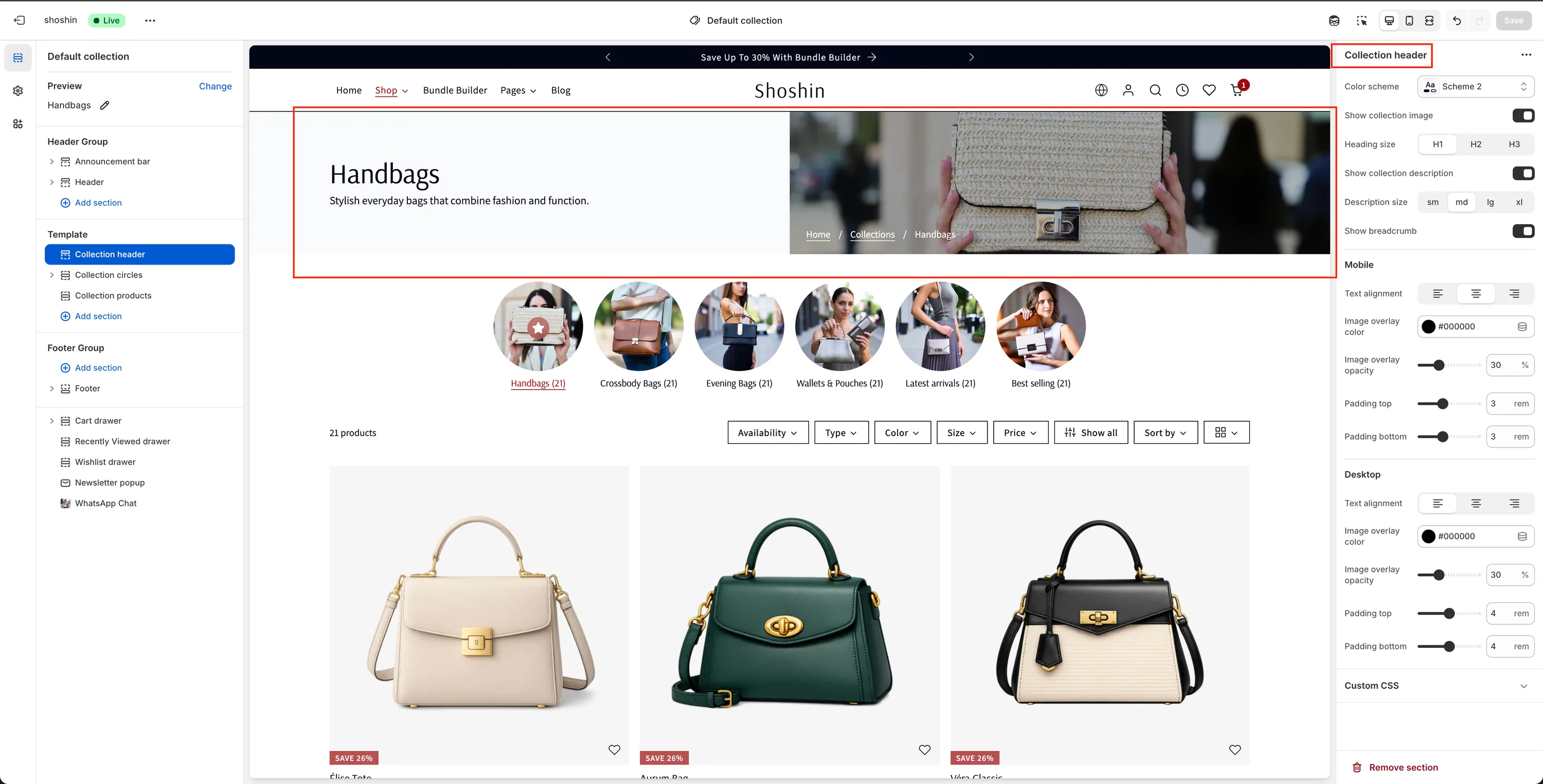
Collection header
A dedicated header section for presenting collection titles, images, and descriptions.
The Collection Header section is designed specifically for the collection page and cannot be added to other page templates. It is used to present essential collection information, including the collection title, featured image, and description.
On desktop, the section features a distinctive split layout where the collection image is displayed on the right by default (with an option to move it to the left), while the collection title and description appear on the opposite side. On mobile, the layout adapts to a more compact design: the collection image appears as a background overlay, with the title and description displayed on top for optimal readability.

Configuration
The section settings are divided into General, Mobile, and Desktop options. General settings apply to both views, while Mobile and Desktop settings allow you to fine-tune the experience for each device type.
General Settings
The following settings are available for the Collection Header section:
Color scheme
Select the preferred color scheme for the section. Note: On mobile, if a collection image is displayed, this setting may have limited effect due to the image overlay.Show collection image
Enable or disable the collection image. Disable this option if you prefer a text-only header.Heading size
Choose the visual size of the collection title. Available options are H1, H2, and H3. Note: This setting only affects the font size. The HTML heading tag remains<h1>for SEO consistency.Show collection description
Toggle the visibility of the collection description, if one is available.Description size
Adjust the description font size. Available options are sm, md, lg, and xl.Show breadcrumb
Enable or disable breadcrumb navigation for improved usability and navigation hierarchy.
Mobile Settings
These settings apply only to mobile view:
Text alignment
Choose how the text is aligned. Options are left, center, or right.Image overlay color
When a collection image is shown, this setting adds a color overlay to improve text readability. Default color:#000000Image overlay opacity
Control the opacity of the overlay color (percentage-based). Higher values improve text legibility. Set to 0 to disable the overlay completely.Padding top
Adjust the top spacing of the section (in pixels).Padding bottom
Adjust the bottom spacing of the section (in pixels).
Desktop Settings
These settings apply only to desktop view:
Image overlay color
Adds a color overlay over the collection image to enhance text contrast. Default color:#000000Image overlay opacity
Control the opacity of the overlay color (percentage-based). Higher values increase text readability. Set to 0 to disable the overlay.Padding top
Adjust the top spacing of the section (in pixels).Padding bottom
Adjust the bottom spacing of the section (in pixels).