Appearance
Hero slideshow
Showcase your big beautiful banner images either in a slideshow but also as a single banner
The Hero slideshow is one of the most important sections of your Shopify store, as it's typically the first thing customers see when they land on your homepage.
This section is fully integrated into our premium theme and looks especially impressive when used with the transparent header option, as shown in the screenshot below.
The Hero slideshow allows you to:
- Display multiple slides, each with an image or video
- Use a single slide as a static hero banner (when only one slide is used, all slideshow controls—such as previous/next buttons and dot indicators—are automatically hidden)
Once set up, the section handles all layout and transitions for you. All you need to do is provide high-quality, large visuals, and the Hero slideshow will take care of the rest.
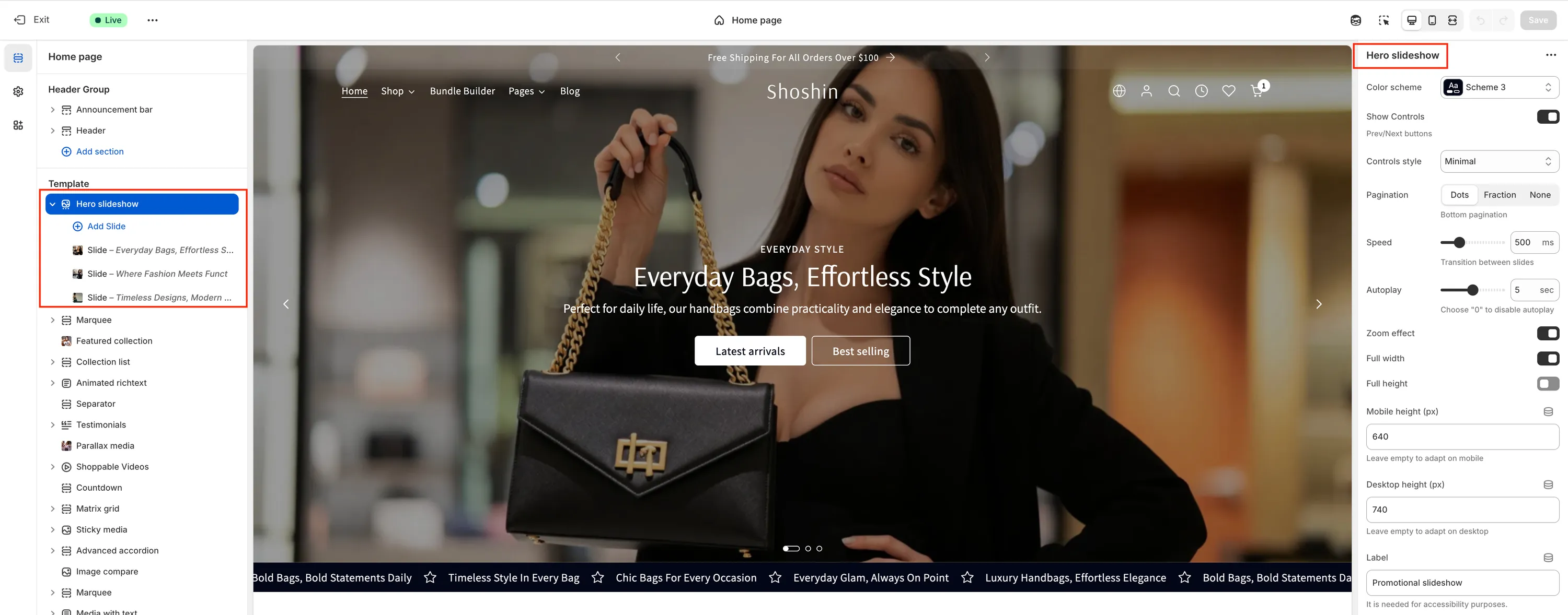
Section settings
As expected, the Hero slideshow offers a wide range of settings to help you customize it exactly to your store's needs. Below is an overview of the available options found in the main section settings.
Color scheme
In most cases, you won't need to change this setting—the default color scheme works well. However, it can be useful if you disable the Full width option and want the section to better match the surrounding content.
Show controls
Shows or hides the previous/next navigation buttons. These controls are automatically hidden when only one slide (block) is present.
Controls style
Choose the visual style of the navigation controls. Available options are:
- Minimal
- Outline
- Inverted
- Accent
Pagination
Controls the pagination displayed at the bottom center of the slideshow. Options include:
- Dots
- Fraction
- None (to hide pagination completely)
Like the controls, pagination is automatically hidden when only one slide is used.
Speed
Defines the transition duration between slides in milliseconds. Higher values result in slower, smoother transitions.
Autoplay
Controls whether slides change automatically. Set this value to 0 to disable autoplay.
Zoom effect
Enables a subtle zoom-in effect on images during slide transitions.
Full width
When enabled, the slideshow spans the full width of the viewport. Disable this option if you prefer the slideshow to align with the page container instead.
Full height
Enables a full-height hero experience for the slideshow. When active, an animated scroll indicator (mouse icon) appears at the bottom center to suggest scrolling for more content.
Mobile height
Set a fixed height for the slideshow on mobile devices. This is especially useful when slides use images with different proportions. Leave empty to automatically adapt to the image height.
Desktop height
Set a fixed height for the slideshow on desktop screens. This helps maintain a consistent layout when using images with varying proportions. Leave empty to adapt to the image height.
Label
A short, descriptive label used for accessibility purposes. This label is not visible on the slideshow itself.
Block settings
In addition to the main section settings, each slide (block) includes its own collapsible set of options. These settings allow you to fully customize the appearance and content of each individual slide.
Below is a breakdown of all available block settings.
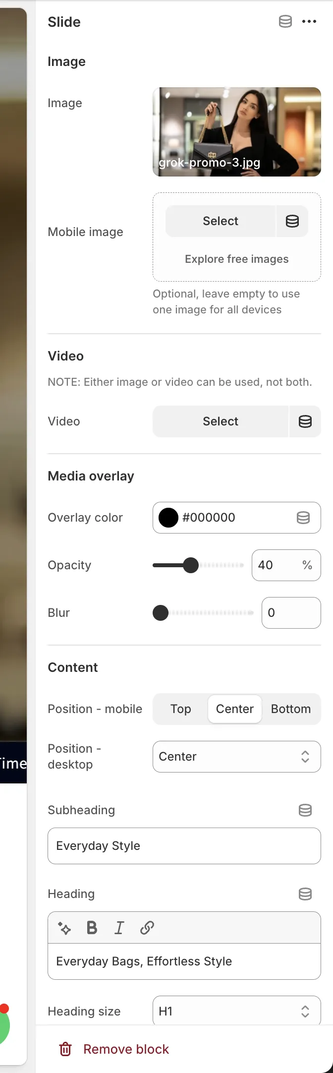
Image
Image
The main image used for the slide. You don't need to worry about image dimensions—upload the image at the highest possible resolution, as Shopify automatically optimizes and resizes images for different devices.
Mobile image
Optionally select a different image for mobile devices. If left empty, the main image will be used for both desktop and mobile.
Video
Video
Select a video if you prefer to display a video instead of an image. When a video is selected, the image settings above are ignored.
Media overlay
Color
Choose the overlay color applied on top of the image or video. Black is commonly used to improve text readability.
Opacity
Controls the overlay opacity as a percentage. Higher values make the image or video less visible.
Blur
Adds a blur effect to the background media. Set to 0 to disable blur.
Content
Position (mobile)
Sets the caption position on mobile devices. Available options:
- Top
- Center
- Bottom
Position (desktop)
Sets the caption position on desktop screens. Available options:
- Left
- Center
- Right
- Bottom
Subheading
A short line of text displayed above the main heading.
Heading
The main slide title. Leave empty to hide the heading.
Heading size
Select the heading level: H1, H2, H3, H4, H5, or H6.
Description font size
Controls the font size of the description text. Available options:
- SM
- MD
- LG
- XL
Primary button
Button label
Text displayed on the primary button. Leave empty to hide the button.
Button style
Choose the visual style of the primary button:
- Primary
- Outline
- Accent
- Link
Button URL
The link destination for the primary button.
Secondary button
Button label
Text displayed on the secondary button. Leave empty to hide the button.
Button style
Choose the visual style of the secondary button:
- Primary
- Outline
- Accent
- Link
Button URL
The link destination for the secondary button.