Appearance
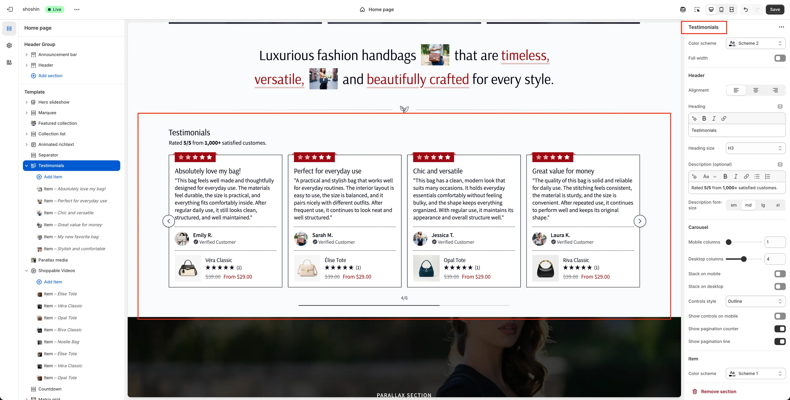
Testimonials
Build trust, social proof, and confidence with real customer feedback
The Testimonials section is one of the most powerful trust-building elements you can add to your store. Showing real feedback from customers helps reduce hesitation, increases credibility, and reassures visitors that your products deliver on their promises.
This section supports animated rating stars, flexible layouts, and optional product linking—allowing you to turn testimonials into conversion-focused content rather than just static quotes.
When to use it
- To build social proof on homepage or landing pages
- To support purchasing decisions on product pages
- To highlight reviews for specific products
- To reinforce brand credibility and customer satisfaction
Section configuration
The Testimonials section provides flexible settings to control layout, appearance, and behavior across devices.
General
Color scheme
Select the color scheme for the entire section.Full width
Enable this option to stretch the section across the full width of the page.
Header
Alignment
Set the alignment of the header content (left, center, or right).Heading
Main title displayed above the testimonials.Heading size
Choose the heading level (H1–H6) to match your page hierarchy.Description (optional)
Supporting text displayed below the heading.Description font size
Control the size of the description text (sm,md,lg,xl).
Carousel
Mobile columns
Number of testimonial cards shown per slide on mobile.Desktop columns
Number of testimonial cards shown per slide on desktop.Stack on mobile
Disable the carousel and stack testimonials vertically on mobile.Stack on desktop
Disable the carousel and stack testimonials vertically on desktop.Controls style
Choose the appearance of navigation controls:Minimal,Outline,Inverted, orAccent.Show controls on mobile
Toggle navigation arrows on mobile devices.Show pagination counter
Display the current slide number.Show pagination line
Display a visual progress indicator.
Item appearance
Color scheme
Apply a specific color scheme to individual testimonial cards.Border
Enable or disable borders around testimonial cards.Shadow
Add a shadow for visual depth.Text alignment
Control how text is aligned inside each card.Image height
Adjust the height of the author image.Circle image
Display the author image as a circle.Heading size
Control the testimonial title size (sm,md,lg,xl).Description font size
Control the testimonial text size (sm,md,lg,xl).Show stars
Display animated rating stars.Product link style
Choose how linked products behave: Quick view or Product page.
Spacing
Top
Top padding of the section (inrem).Bottom
Bottom padding of the section (inrem).
Testimonial block settings
Each testimonial is added as an individual block within the section. This allows you to fully control content per testimonial.
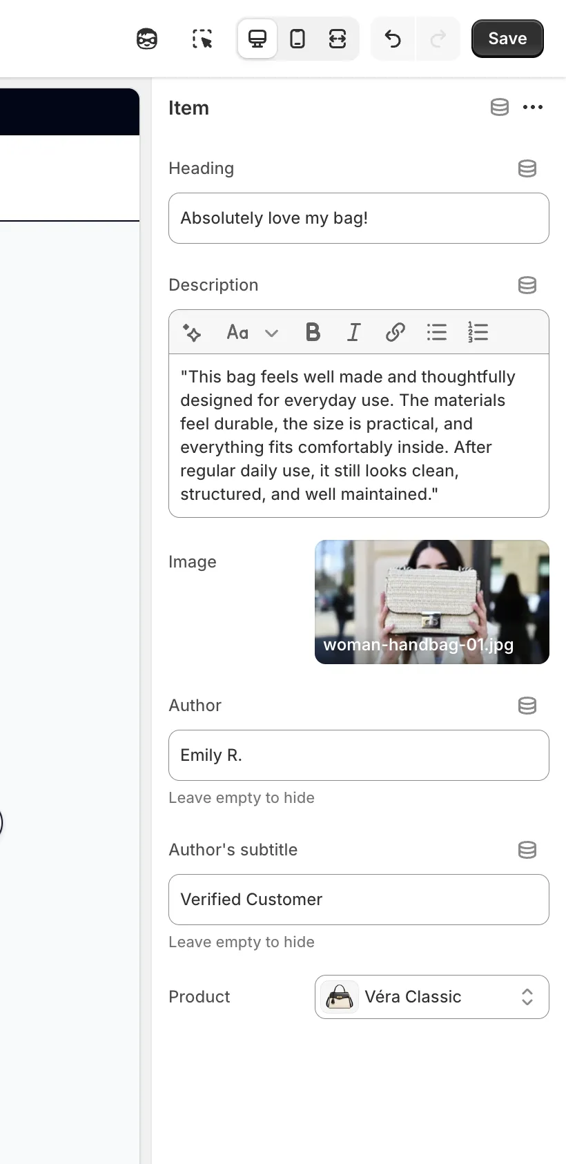
Each testimonial block includes the following settings:
Heading
Short title or summary of the testimonial.Description
The main testimonial text.Image
Author image or avatar.Author
Name of the person giving the testimonial. Leave empty to hide.Author subtitle
Secondary text shown below the author name (e.g. Verified customer). Leave empty to hide.Product
Optional product linked below the testimonial, useful for highlighting specific reviews.
Best practices
- Use real customer photos whenever possible
- Keep testimonials short and readable
- Link testimonials to relevant products for higher conversions
- Mix emotional feedback with practical benefits
- Avoid overcrowding—5–10 testimonials per section works best
The Testimonials section is most effective when it feels authentic, focused, and easy to scan.