Appearance
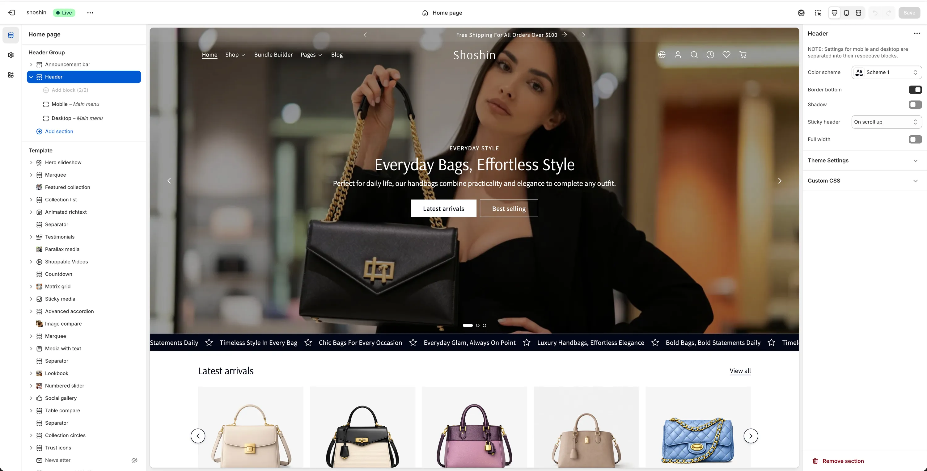
Header
A flexible and fully responsive header system designed to handle navigation, branding, and key actions across all pages, with separate controls for mobile and desktop.
The Header is one of the most important sections of the theme. Together with the footer, it appears on all pages of your Shopify store, making it a key element for navigation, branding, and usability.
Our header was built with flexibility in mind and carefully optimized for both mobile and desktop, ensuring a clean layout, smooth interactions, and consistent behavior across devices.
Header structure & logic
To keep the settings intuitive and easy to manage, the header logic is split into two separate blocks:
- Mobile block – Controls how the header behaves on mobile devices
- Desktop block – Controls how the header behaves on desktop devices
Each block contains settings that apply only to that specific viewport. In addition, the Header section itself includes global settings that affect both mobile and desktop.
INFO
To change the setting for the transparent header, please refer to the Transparent header tutorial
Section settings
WARNING
These settings control the overall appearance and behavior of the header, regardless of screen size (mobile or desktop)
- Color scheme – Choose the color scheme used by the header
- Border bottom – Enable or disable the bottom border
- Shadow – Add a shadow to the header
- Sticky header – Controls how the header behaves while scrolling:
None,On scroll up,Always
Mobile block
Applies to mobile devices (max width: 1199px)
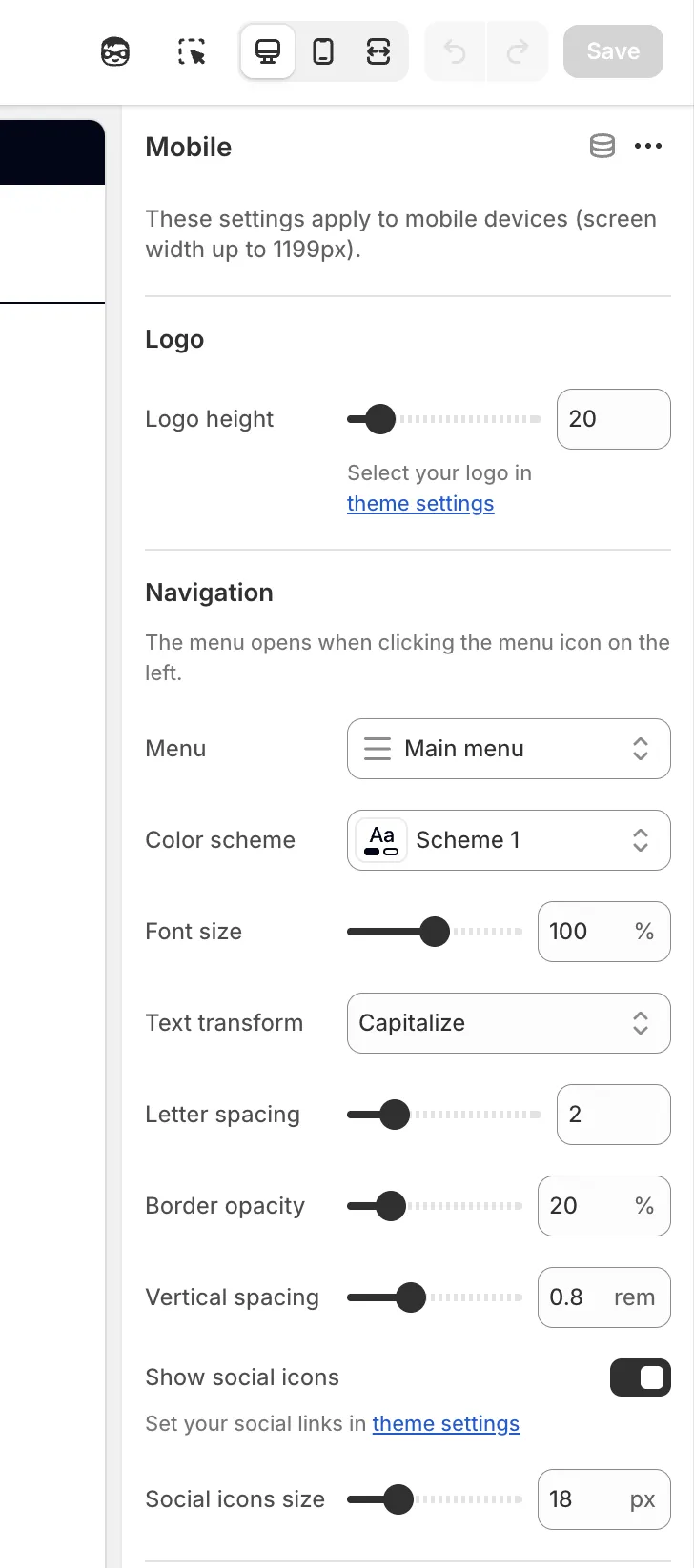
Logo
Logo source
The logo is selected from the Theme settingsLogo height
Adjust the logo size by setting its height in pixels
Navigation
The mobile menu opens when clicking the menu icon on the left side.
- Menu – Select the menu used for mobile navigation
- Color scheme – Menu color scheme
- Font size – Font size as a percentage relative to the main body font
- Text transform – Options:
None,Capitalize,Lowercase,Uppercase - Letter spacing – Adjust spacing between letters
- Border opacity – Control menu border visibility
- Vertical spacing – Space between menu items
Social icons
- Show social icons – Enable or disable social icons
- Social icons size – Adjust icon size
Header icons
Left icon - Choose your preferred icon to show on the left side of the header
Options:Search,Account,Recently Viewed,Wishlist,LocalizationRight icon - Choose your preferred icon to show on the right side of the header
Options:Search,Account,Recently Viewed,Wishlist,LocalizationSize – Adjust the icon size. Default:
20pxStroke width – Adjust the icon stroke width. Default:
1.6px
Spacing
- Top – Top padding (in pixels)
- Bottom – Bottom padding (in pixels)
Desktop block
Applies to desktop devices (min width: 1200px)
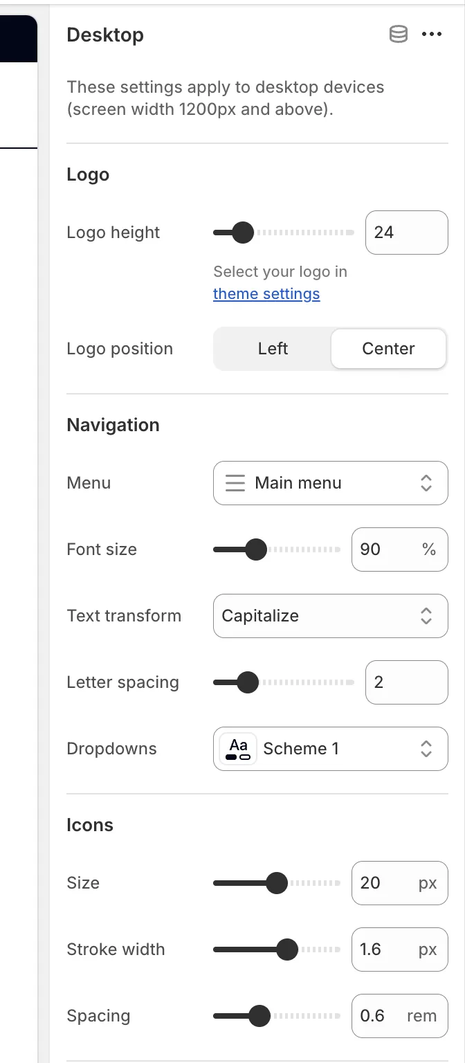
Logo
Logo source
The logo is selected from the Theme settingsLogo height
Adjust the logo size by setting its height in pixelsLogo position
LeftCenter
Navigation
- Menu – Select the desktop navigation menu
- Font size – Adjust menu font size
- Text transform – Control text capitalization
- Letter spacing – Adjust spacing between letters
- Dropdowns color scheme – Color scheme used for dropdown menus
Icons
- Size – Default:
20px - Stroke width – Default:
1.6px - Spacing – Default:
0.6rem
Spacing
- Top – Top padding
- Bottom – Bottom padding
By separating mobile and desktop settings, the header gives you full control over each layout while keeping the configuration simple and predictable.