Appearance
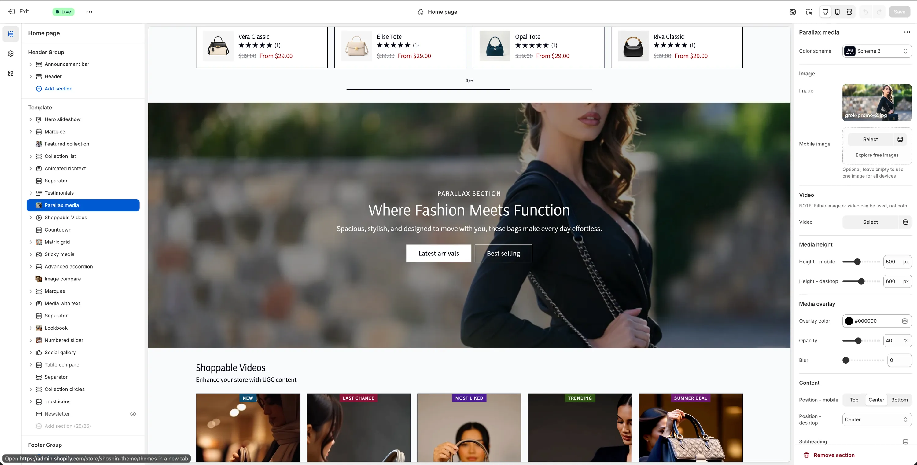
Parallax media
Bring your content to life with immersive media and subtle parallax motion.
The Parallax media section is designed to create a strong visual impact by combining immersive media with a subtle parallax scrolling effect. It's ideal for storytelling, brand moments, or highlighting key campaigns while keeping the layout clean and modern.
This section allows you to display a large media element that moves at a different speed than the page scroll, creating a sense of depth as users navigate through your store.
Configuration
The Parallax Media section provides a focused set of options that allow you to control the media, layout, overlay, and content positioning while maintaining a clean and immersive visual experience.
Media
You can use either an image or a video as the main background media (not both).
Image
Image
Select an image to use as the main background with the parallax effect enabled. Shopify automatically handles image optimization and cropping, so you don't need to worry about exact image dimensions.Mobile image
Optional image specifically for mobile devices. Leave this empty to use the same image across all screen sizes.
Video
Note
When a video is selected, image settings are ignored.
- Video
Select an MP4 video to use as the background media with the parallax effect enabled.
Media Height
Height – mobile (px)
Sets the section height on mobile devices. The media will be centered vertically to respect this value.Height – desktop (px)
Sets the section height on desktop devices. The media will be centered vertically to respect this value.
Media Overlay
Overlay color
Adds a color overlay on top of the media to improve text readability. Default:#000000Opacity (%)
Controls the transparency of the overlay. Higher values increase text legibility.Blur
Applies a blur effect to the media for additional contrast and visual refinement.
Content
Position – mobile
Controls vertical alignment of the content on mobile devices. Available options:- Top
- Center
- Bottom
Position – desktop
Controls content alignment on desktop devices. Available options:- Left
- Center
- Right
- Bottom
Subheading
Optional text displayed above the main heading.Subheading font size
Available options: sm, md, lg, xlHeading
Main title for the section.Heading size
Available options: H1, H2, H3, H4, H5, H6Description
Supporting text displayed below the heading.Description font size
Available options: sm, md, lg, xl
Buttons
Primary Button
Button label
Text for the primary button. Leave empty to hide the button.Button URL
Link destination for the primary button.Button style
Available options: Primary, Outline, Accent, Link
Secondary Button
Button label
Text for the secondary button. Leave empty to hide the button.Button URL
Link destination for the secondary button.Button style
Available options: Primary, Outline, Accent, Link
Spacing
Padding top
Adjust the top spacing (margin) of the section.Padding bottom
Adjust the bottom spacing (margin) of the section.