Appearance
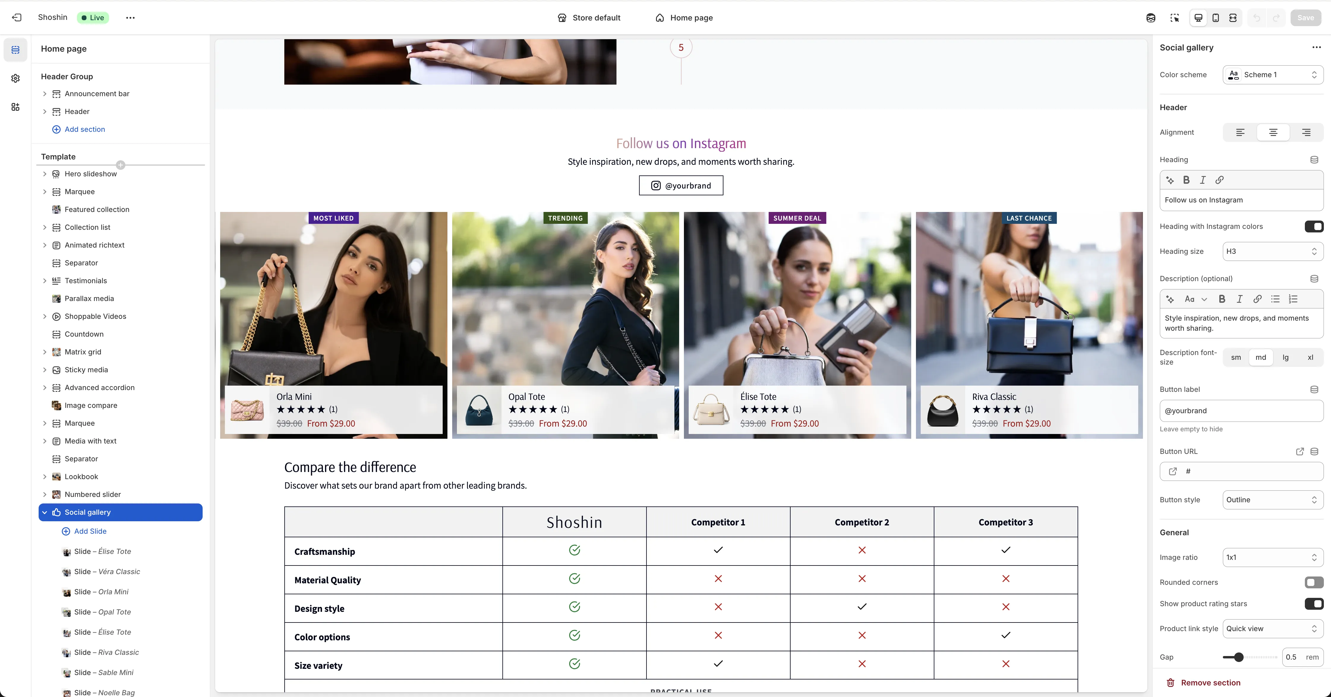
Social gallery
Showcase your product photos in a beautiful slider with a social media-inspired aesthetic
The Social gallery section lets you display your product photos in an engaging slider format with a modern, social media-inspired design. Manually add and organize your photos to create a visually cohesive shopping experience that connects your products with lifestyle imagery.
The Social gallery is perfect for:
- Displaying product photos and lifestyle imagery in a slider format
- Showcasing models wearing or using your products
- Building trust and authenticity with high-quality photography
- Creating an engaging visual experience with a modern, social-inspired aesthetic
- Linking products directly to the photos featuring them
Configuration
The Social gallery section includes comprehensive settings to customize both the overall appearance and individual slides.
Main section settings
Color scheme - Select a color scheme that matches your store's branding and design theme.
Header
Alignment - Control the text alignment for the header section. Choose from Left, Center, or Right.
Heading - Enter your main title for the gallery section (e.g., "Follow us on Instagram").
Heading with Instagram colors - Enable this option to style the title with Instagram-inspired gradient colors.
Heading size - Choose the heading size from H1 to H6 to match your page hierarchy.
Description (optional) - Add a short description or tagline below the heading to provide additional context.
Description font size - Set the text size for the description. Options are Small, Medium, Large, or Extra Large.
Button label - Enter text for the Instagram profile button (e.g., "@yourbrand"). Leave empty to hide the button.
Button URL - Link to your Instagram profile page or other social media URL.
Button style - Choose the button appearance. Options are Primary, Outline, Accent, or Link.
General
Image ratio - Set the aspect ratio for your images to ensure consistent display across all slides.
Rounded corners - When enabled, applies the global border radius theme setting to image corners for a softer appearance.
Show product rating stars - Enable to display star ratings for the attached products.
Product link style - Choose how customers interact with products. Options are Quick View (opens a modal) or Product Page (links to the full product page).
Gap - Control the spacing between slides in the gallery.
Autoplay - Enable or disable automatic slide progression.
Autoplay time - Set the duration (in seconds) before the slider automatically moves to the next slide. Default is 3 seconds.
Spacing
Top - Add padding to the top of the section.
Bottom - Add padding to the bottom of the section.
Block settings
Each slide is added as a block within the section. Configure the following settings for each block:
Image - Select the product photo or lifestyle image to display in the slide.
Link URL - Enter the URL to link the image to (e.g., Instagram post URL or external link).
Product - Attach a Shopify product to the slide. The product will be displayed at the bottom of the image, allowing customers to connect the visual with the featured item.
Custom badge - Add optional text for a badge that appears on the top of the image (e.g., "New", "Sale", "Featured"). Leave empty to hide the badge.
Custom badge color - Choose a color for the badge to highlight promotions or key information.