Appearance
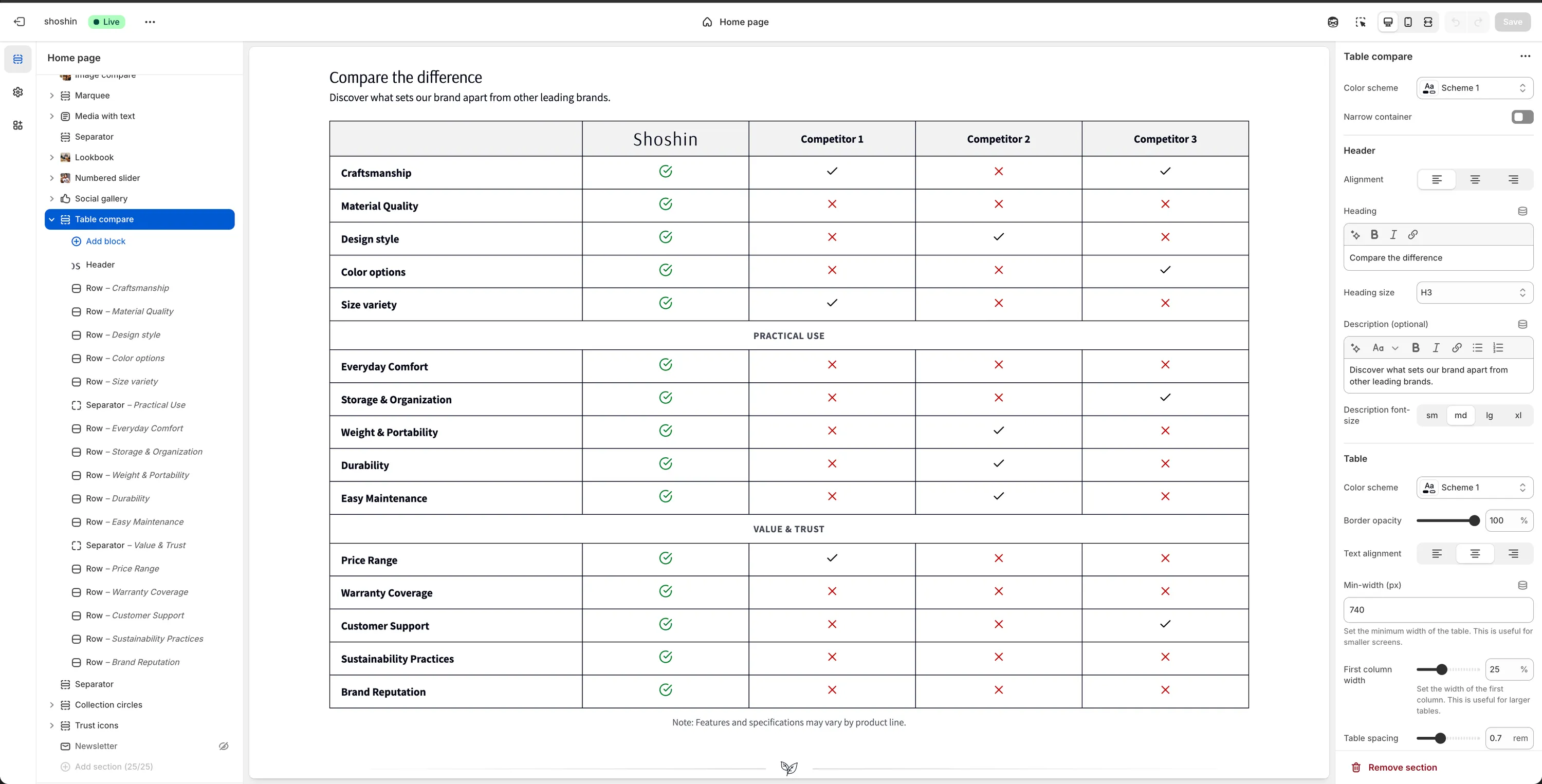
Table compare
Compare features, plans, or products side by side to guide purchase decisions
The Table compare section is a powerful way to highlight your product's strengths by comparing features, plans, or benefits side by side. It helps customers quickly understand differences and make confident buying decisions.
This section is commonly used to:
- Compare your product vs competitors
- Compare different products or plans within your store
- Highlight key advantages at a glance
With flexible configuration options and block-based logic, the Table compare section scales well even for large comparison tables.
When to use it
- On landing pages to reinforce value propositions
- On product or collection pages to compare alternatives
- When customers need clear, structured comparisons before buying
Section configuration
Besides the common section settings (color scheme, heading, description), the Table compare section includes the following table-specific options.
Table
Color scheme
Apply a different color scheme to the table itself, independent of the section background.Border opacity
Control the opacity of table borders (percentage-based).Text alignment
Set the alignment for table content.Min width (px)
Define a minimum table width. Useful for smaller screens and horizontal scrolling.First column width
Set the width of the first column (feature names). Recommended for large tables.Cell spacing
Control padding inside table cells (inrem).Caption
Optional text displayed below the table.Header image height
Set the height (in pixels) for header images, such as logos.
Table structure (important)
The table is built entirely using blocks. There are three block types, and they must be used in the correct order for the table to render properly.
Block types
1. Header block
- Can be added only once
- Must be the first block in the section
- Defines the table columns
You can use up to 7 columns (groups). You don't need to use all of them—leave unused fields empty.
Each header column includes:
- Text
Text displayed in the header cell
TIP
If you want the first header cell to be empty, enter #
- Image
Optional image (e.g. brand or product logo)
2. Row block
Used to define a standard comparison row.
- Title
Feature name (shown in the first column)
Each row supports up to 6 comparison cells, matching the header columns.
Each cell includes:
- Icon
Choose from:None,Checked circle,Checked,Unchecked,Plus,Minus
TIP
💡 Checked circle is ideal for highlighting your own product.
- Text
Optional text displayed below the icon. You can use icon only, text only, or both.
WARNING
The number of cells should match the header columns to ensure proper alignment.
3. Separator block
Used to visually group rows into sections.
- Contains one centered title
- Does not include comparison cells
- Ideal for large tables with many features
Best practices
- Keep tables focused and scannable
- Use icons consistently across rows
- Highlight your product using checked circle icons
- Use separator blocks to avoid overwhelming users
- Avoid comparing too many columns at once (3–5 works best)