Appearance
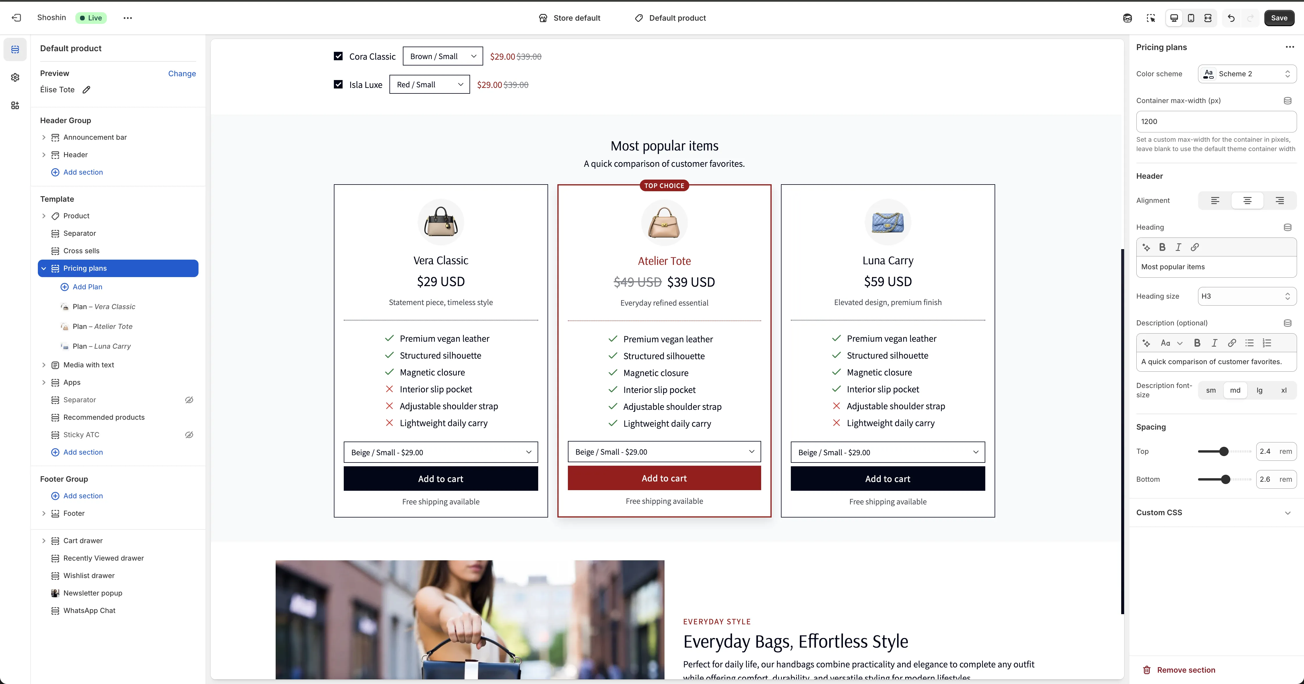
Pricing Plans
Compare plans, products, or variants with feature lists and quick add-to-cart.
The Pricing Plans section lets you present three or four plan-style cards with feature lists so customers can compare options at a glance. Each plan can be linked to a product, enabling direct add-to-cart right from the card. This makes it ideal for comparing products or even variants on a product page, while providing a fast path to purchase.
Configuration
The section uses blocks for each plan. If you want to show three plans, add three blocks—one per plan.
Block Settings
- Color scheme - Choose a unique color scheme for this plan card. In this way, you can have different schemes for each of your plans, making the plans styling different from each other.
- Highlighted plan - Visually emphasize this plan as a featured or recommended option.
- Alignment - Set the text alignment for the plan card content. Options are left, center, and right.
Header
Badge (optional) - Add a short label at the top (e.g., “Best Value”).
Icon (image) - Display an icon or image above the plan name.
Icon size - Adjust the displayed size of the icon. This is measured in pixels.
Icon circle background - Check this if you like the icon to show as a circle.
Heading - The plan name or title.
Heading size - Choose the heading size for the plan title.
Price - The plan price or primary value. Put the old price in brackets, like [ $400] $300, and the price in the bracket will show as strikethrough text.
Price font size - Adjust how large the price appears.
Description (optional) - Short supporting text for the plan.
Description font size - Control the size of the description text.
Body
Content (feature list) - Add the main feature list for this plan. Use [x] for a checkmark icon and [y] for an X icon to indicate which features are included or excluded for each plan.
Example:
[x] Premium vegan leather
[x] Structured silhouette
[y] Magnetic closure
[y] Interior slip pocket
[x] Adjustable shoulder strap
[x] Lightweight daily carry
Content font size - Control the size of the feature list text.
Footer
Button label - Text for the call-to-action button; leave blank to hide it.
Button style - Choose the button appearance.
Button mode - Select between URL and Add to cart. If you select URL, the URL setting will show; if you select Add to cart, the Product setting will show.
URL - The link destination when URL mode is selected.
Product - The product to add when Add to cart mode is selected (variants can be chosen).
Note (optional) - Optional small note below the plan (e.g., “Free shipping available”).
Note font size - Adjust the size of the note text.