Appearance
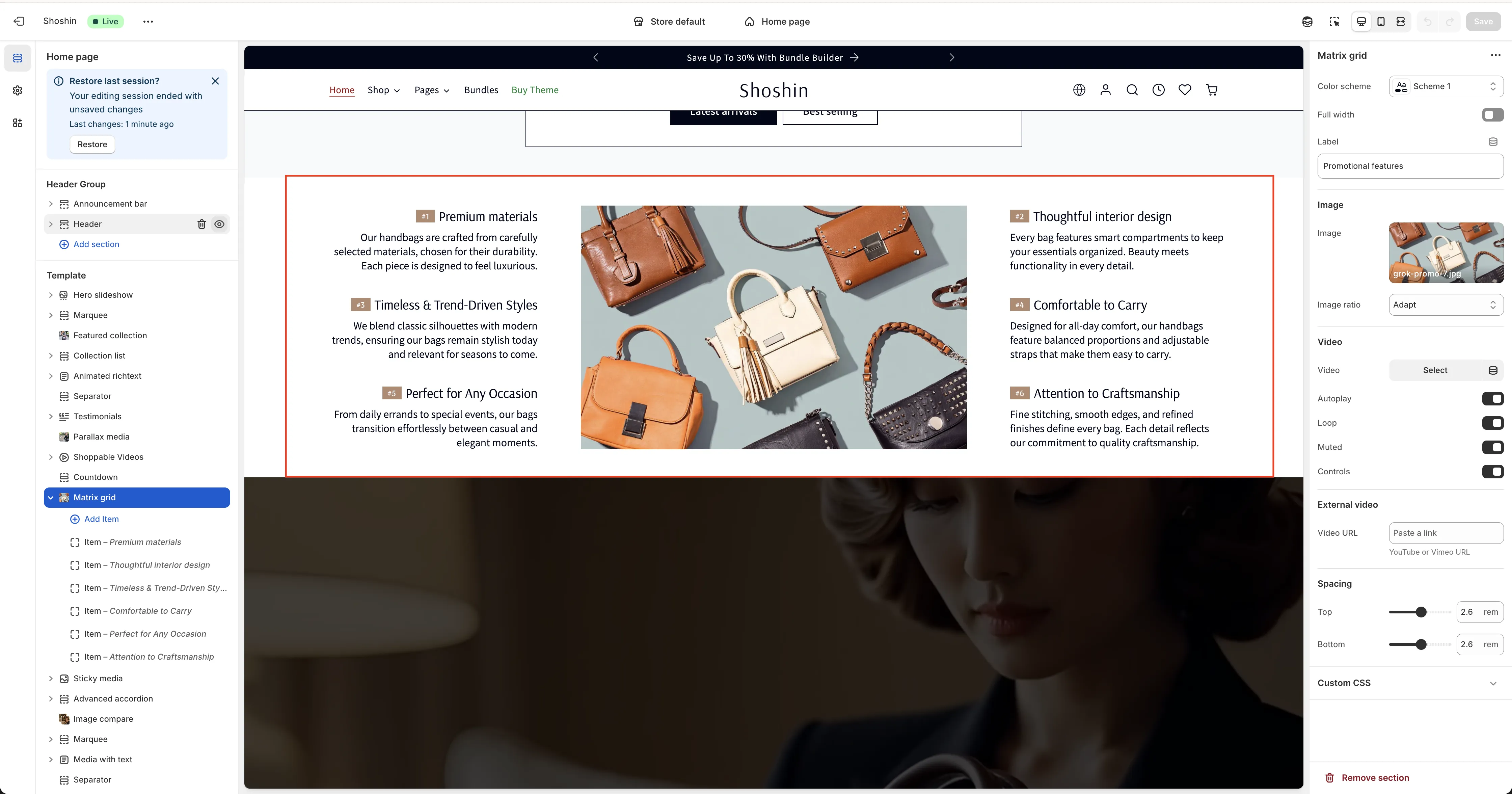
Matrix Grid
Create immersive layouts with centered media and complementary content blocks.
The Matrix Grid section is an advanced layout tool that positions your primary media (images or videos) at the center, with complementary information blocks displayed on the left and right sides. This creates a balanced, visually engaging design that draws attention to your focal content.
On mobile devices, the layout adapts intelligently—the complementary blocks move below the media and become scrollable, ensuring an optimal viewing experience on smaller screens.
This responsive design makes it perfect for showcasing featured products, highlighting key content, or creating eye-catching hero sections.
Configuration
The Matrix Grid section provides comprehensive options to control both the main media and complementary blocks.
Main Media
In the section settings, you can select your primary media:
- Image - A standard image file
- Video (MP4) - A locally hosted MP4 video
- External Video - YouTube or Vimeo videos
You can only display one media type at a time. Additional settings allow you to customize the appearance and behavior of your chosen media.
Complementary Blocks
Each block around the main media can include:
- A small image
- A custom badge
- A title
- A description
- A button
Blocks are displayed alternately on desktop—one on the left and one on the right of the central media. On mobile, all blocks are displayed below the media as a scrollable list.
You can add as many blocks as needed, and they'll automatically alternate between left and right positioning on desktop.